Icon
Examples#
To browse and visualize all available icons, visit our icons browser
Basic Example#
from typing import cast
import flet as ft
def main(page: ft.Page):
page.add(
# material
ft.Row(
controls=[
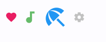
ft.Icon(ft.Icons.FAVORITE, color=ft.Colors.PINK),
ft.Icon(ft.Icons.AUDIOTRACK, color=ft.Colors.GREEN_400, size=30),
ft.Icon(ft.Icons.BEACH_ACCESS, color=ft.Colors.BLUE, size=50),
ft.Icon(ft.Icons.SETTINGS, color="#c1c1c1"),
]
),
# cupertino
ft.Row(
controls=[
ft.Icon(ft.CupertinoIcons.PROFILE_CIRCLED, color=ft.Colors.PINK),
ft.Icon(
icon=cast(ft.CupertinoIcons, ft.CupertinoIcons.random()),
color=ft.Colors.GREEN_400,
size=30,
),
ft.Icon(
icon=cast(ft.CupertinoIcons, ft.CupertinoIcons.random()),
color=ft.Colors.BLUE,
size=50,
),
ft.Icon(
icon=cast(ft.CupertinoIcons, ft.CupertinoIcons.random()),
color="#c1c1c1",
),
]
),
)
if __name__ == "__main__":
ft.run(main)
Bases: ConstrainedControl
A control that displays an icon from a built-in or custom icon set.
Icons can be customized in color, size, and visual style using various parameters such as stroke weight, fill level, and shadows.
| RAISES | DESCRIPTION |
|---|---|
AssertionError
|
If |
AssertionError
|
If |
AssertionError
|
If |
animate_offset: AnimationValue | None = None
animate_opacity: AnimationValue | None = None
animate_position: AnimationValue | None = None
animate_rotation: AnimationValue | None = None
animate_scale: AnimationValue | None = None
apply_text_scaling: bool | None = None
Whether to scale the icon based on the system or user's preferred text size.
Useful when placing icons alongside text, ensuring both scale consistently for better readability and accessibility.
The blend mode used when rendering the icon.
Blend modes control how the icon's color interacts with the background.
The default is normal blending (SRC_OVER).
bottom: Number | None = None
The distance that the child's bottom edge is inset from the bottom of the stack.
Note
Effective only if this control is a descendant of one of the following:
Stack control, Page.overlay list.
col: ResponsiveNumber = 12
If a parent of this control is a ResponsiveRow,
this property is used to determine
how many virtual columns of a screen this control will span.
Can be a number or a dictionary configured to have a different value for specific
breakpoints, for example col={"sm": 6}.
This control spans the 12 virtual columns by default.
Dimensions
| Breakpoint | Dimension |
|---|---|
| xs | <576px |
| sm | ≥576px |
| md | ≥768px |
| lg | ≥992px |
| xl | ≥1200px |
| xxl | ≥1400px |
disabled: bool = False
Every control has disabled property which is False by default - control and all
its children are enabled.
Note
The value of this property will be propagated down to all children controls recursively.
expand_loose: bool = False
Allows the control to expand along the main axis if space is available, but does not require it to fill all available space.
More information here.
fill: Number | None = None
The fill amount of the icon, between 0.0 (outline) and 1.0 (solid).
This feature requires the icon's font to support fill variation. It can be used to indicate state transitions or selection visually.
grade: Number | None = None
A fine-tuning adjustment for the stroke thickness of the icon.
This requires support from the icon's font. Grade values can be negative or positive. It allows precise visual adjustments without changing icon size.
icon: IconData
The icon to display, selected from a predefined icon set.
You can explore available icons using the Flet Icons Browser.
left: Number | None = None
The distance that the child's left edge is inset from the left of the stack.
Note
Effective only if this control is a descendant of one of the following:
Stack control, Page.overlay list.
offset: OffsetValue | None = None
Applies a translation transformation before painting the control.
The translation is expressed as an Offset scaled to the control's size.
So, Offset(x=0.25, y=0), for example, will result in a horizontal translation
of one quarter the width of this control.
Example
The following example displays container at 0, 0 top left corner of a stack as
transform applies -1 * 100, -1 * 100 (offset * control's size) horizontal and
vertical translations to the control:
on_animation_end: (
    ControlEventHandler[ConstrainedControl] | None
) = None
Called when animation completes.
Can be used to chain multiple animations.
The data property of the event handler argument contains the name of the animation.
More information here.
opacity: Number = 1.0
Defines the transparency of the control.
Value ranges from 0.0 (completely transparent) to 1.0 (completely opaque
without any transparency).
optical_size: Number | None = None
Adjusts the icon's visual style for different sizes to maintain clarity and balance.
This requires the icon font to support optical sizing.
Must be greater than 0.
parent: BaseControl | None
The direct ancestor(parent) of this control.
It defaults to None and will only have a value when this control is mounted
(added to the page tree).
The Page control (which is the root of the tree) is an exception - it always
has parent=None.
right: Number | None = None
The distance that the child's right edge is inset from the right of the stack.
Note
Effective only if this control is a descendant of one of the following:
Stack control, Page.overlay list.
rotate: RotateValue | None = None
Transforms this control using a rotation around its center.
The value of rotate property could be one of the following types:
number- a rotation in clockwise radians. Full circle360°ismath.pi * 2radians,90°ispi / 2,45°ispi / 4, etc.Rotate- allows to specify rotationangleas well asalignment- the location of rotation center.
scale: ScaleValue | None = None
Scales this control along the 2D plane. Default scale factor is 1.0, meaning no-scale.
Setting this property to 0.5, for example, makes this control twice smaller, while 2.0 makes it twice larger.
Different scale multipliers can be specified for x and y axis, by setting
Control.scale property to an instance of Scale class.
Either scale or scale_x and scale_y could be specified, but not all of them.
semantics_label: str | None = None
An accessibility label for the icon.
This text is not displayed visually but may be announced by screen readers or other assistive technologies.
shadows: BoxShadowValue | None = None
A list of shadows to apply beneath the icon.
Use multiple shadows to simulate complex lighting effects. The order of shadows matters for how transparency is blended.
size: Number | None = None
The size (width and height) of the square area the icon will occupy.
If not set, a default size will be used. When placing this icon inside other controls (such as buttons), those controls may also affect sizing.
tooltip: TooltipValue | None = None
The tooltip ot show when this control is hovered over.
top: Number | None = None
The distance that the child's top edge is inset from the top of the stack.
Note
Effective only if this control is a descendant of one of the following:
Stack control, Page.overlay list.
visible: bool = True
Every control has visible property which is True by default - control is
rendered on the page. Setting visible to False completely prevents control (and
all its children if any) from rendering on a page canvas. Hidden controls cannot be
focused or selected with a keyboard or mouse and they do not emit any events.
weight: Number | None = None
The stroke weight (thickness) of the icon's lines.
This requires the icon font to support weight variation.
Must be greater than 0.
Called once during control initialization to define its child controls. self.page is available in this method.